Principle 5: Use Color Purposefully

When used purposefully, color can be a great way to spice up your designs and draw attention to important information. By using a different color in your headers or images, brains can stay more engaged. Studies also show that different colors can have a subconscious impact on our engagement and concentration, helping to evoke feelings like joy, calm, and peace.
On the dark side, too much color can lead to overwhelm and confusion. Color is also subjective, and a beautiful design to one person may be hard to read or overwhelming to another. But most essentially, many eyes are simply unable to see the color combinations chosen by well-meaning people.
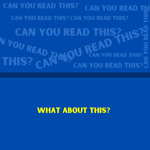
Take a look at the three examples below. All three are visually appealing, but only one has a high enough contrast between the background and the text color to be accessible. When in doubt, use a color accessibility checker to ensure that all eyes can read your material.


When it comes to color, less is better than more and high contrast always wins. Keep these other suggestions in mind to ensure that your students can focus on and enjoy all the resources in your classroom:
- Maintain high contrast between text and background colors
- Never use color as the only way to convey information (e.g. use patterns or text to show information in charts and graphs)
- Use consistent colors for specific types of information (e.g., examples, definitions, practice problems)
- Limit your color palette to 2-3 colors when using it in a design (e.g. the background color, a main color, and an accent color)
- Consider your school's colors for consistency across materials

Above all else, have fun! Enjoy the design process while keeping the ideas of simplicity, consistency, and clarity in mind to build more accessible and engaging learning materials.


