Principle 3: Font Establishes Feeling & Tone
If you look at a handout created for a third grader and a college sophomore, you already understand that font choices help establish feeling and tone.
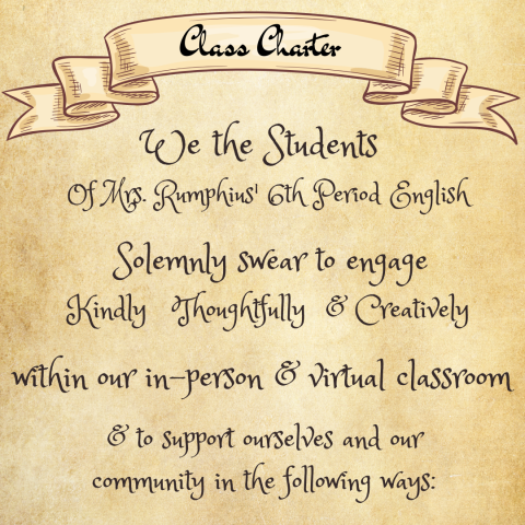
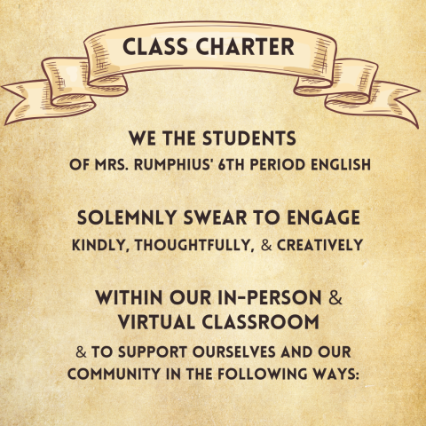
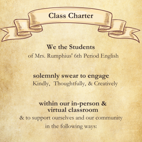
Take a look at the following class charters. The first font choice is fun but difficult to read. The second uses a sans serif font, and the third uses a serif font. Each of them conveys the same information but with a different look and feel.


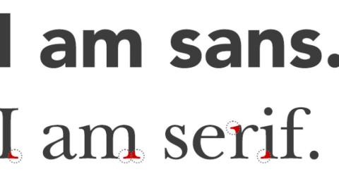
What are serif and sans serif fonts?

Serif fonts include small decorative lines and tapers at the end of letters. They offer a more formal appearance and are used to convey a sense of ethos and credibility, like the fonts used by the New York Times or a financial institution. Serif fonts are traditionally used in printed books and newspapers because the lines and tapers help guide your eyes along text on paper.
Sans serif fonts represent a category of typography that do not have the decorative "feet" or "tails" at the ends of letters. They look clean and fun and modern, like the default text for Microsoft Word, forward-thinking companies like Rivian, and this webpage! Sans serif fonts are often used for digital screens because they're easier to read at smaller sizes on devices. They have also been shown to better support dyslexic learners.
You can also mix and match serif and sans serif fonts. Designers often use serif for the headers and sans serif for the text (or vice-versa) to help establish visual hierarchy and guide readers through text.
- Include small decorative lines or tapers at the ends of letters
- Give a more traditional or formal look
- Used to convey ethos and credibility (e.g. the New York Times or a financial institution
- Traditionally used in printed books and newspapers because they help guide an eye along the printed page
- No decorative lines or feet at the ends of letters
- Look clean and fun and modern (e.g. default text in emails or forward-thinking companies), and can help convey a sense of connection
- Often used for digital screens because they're easier to read at smaller sizes on devices
- Have been shown to better support dyslexic learners
Curious to learn more?
Check out this iLearnNH YouTube video exploring how to establish the tone of your classroom through your choice of typography.
And remember, there's no right or wrong choice when it comes to selecting a font. It is simply that-- a choice, and one that you have already been making for years. The key is to do it thoughtfully and intentionally, since whether you like it or not, your choices will impact how your students engage with the material.


